PROJECT · 2025 — Present
A kitchen assistant that thinks ahead — Pantry Chef
Most food gets wasted because awareness comes too late. I designed and built a React Native app that tracks what's in your kitchen, warns you before things expire, and uses AI to turn what's left into something worth eating.
Role
Product Designer & Developer (solo)
Timeline
Ongoing · 2025 – Present
Team
Personal project
Stack
React Native, Cursor, Figma, AI APIs

Food waste isn't usually about carelessness — it's about visibility. People don't check expiry dates when they're cooking at 7pm. They don't remember the yogurt at the back of the fridge until it's already gone. Standard reminder apps treat food like calendar events, which doesn't match how people actually think about their kitchen.
01 — THE PROBLEM
The warning always comes one day too late
I wanted to build something that lives one step ahead: you add items when you buy them, and the app does the work of tracking, warning, and suggesting what to do before anything goes bad.
The secondary problem was friction at the point of entry. Typing out every grocery item manually kills the habit in a week. The app needed a faster path in — barcode scanning — so adding items took seconds, not minutes.
02 — APPROACH
Design around the moment of purchase, not the moment of disposal
Most food waste apps focus on the disposal end — "you have 3 items expiring today." That's too late to change behavior. I designed the flow around the purchase moment: scan the barcode, confirm the quantity, set the location (fridge, freezer, pantry), and the app handles everything after.
The UX principle guiding every decision was reduce cognitive load at the right moment. When you're unpacking groceries, you have 30 seconds per item. When you're cooking at midnight, you want one tap to get a recipe — not a settings menu.
I used Cursor to accelerate the React Native build, which let me stay in design thinking mode while still shipping real, functional code. Figma for the system, Cursor for the build, AI APIs for the intelligence layer.
03 — DESIGN DECISIONS
Five decisions that shaped the product
Decision 1: Streak and gamification on the home screen
The home dashboard opens with "Good morning, Chef!" and a streak counter — currently showing 16 foods rescued. This wasn't decoration. Habit-forming products need a feedback loop that makes responsible behavior feel rewarding. The streak makes "not wasting food" visible and personal.
The alternative was a pure utility dashboard — just a list. It would have been cleaner but wouldn't have created any reason to open the app daily.
Decision 2: Storage location as a first-class filter
The pantry view has three tabs at the top: Fridge, Freezer, Pantry. This mirrors the physical reality of a kitchen, not a database category. People think in locations, not product types. Filtering by location first reduces the list to what's actually relevant in the moment.
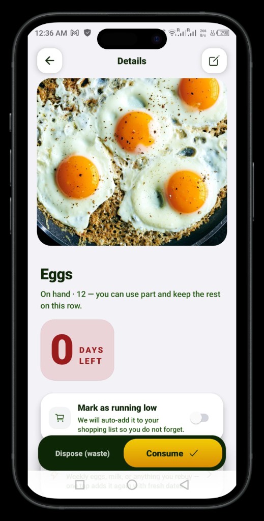
Decision 3: Overdue state design
Items past their use-by date show a red "0 DAYS LEFT / OVERDUE" badge — high contrast, impossible to miss. But the detail screen doesn't just flag the problem. It offers two explicit actions: Consume or Dispose (waste). Marking something as wasted feeds the streak counter in reverse, creating a small but real consequence that nudges behavior.
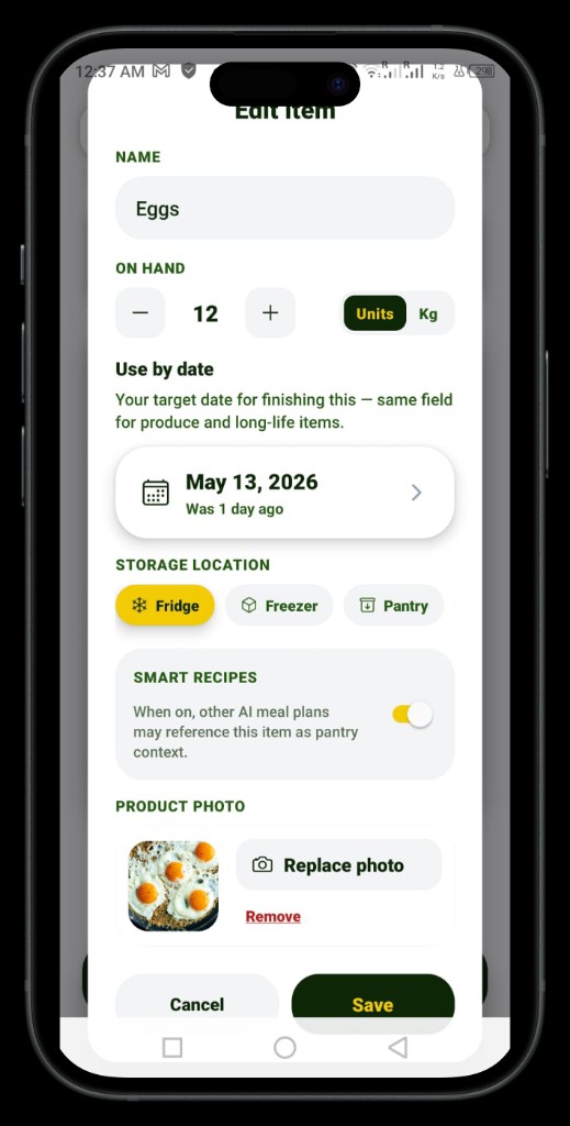
Decision 4: Smart Recipes toggle per item
In the Edit Item screen, there's a "Smart Recipes" toggle. When on, that item becomes available as context for AI meal plan generation. This gives users control over what the AI considers — useful for dietary restrictions or items they're saving for something specific. Most apps apply AI globally; this makes it granular.
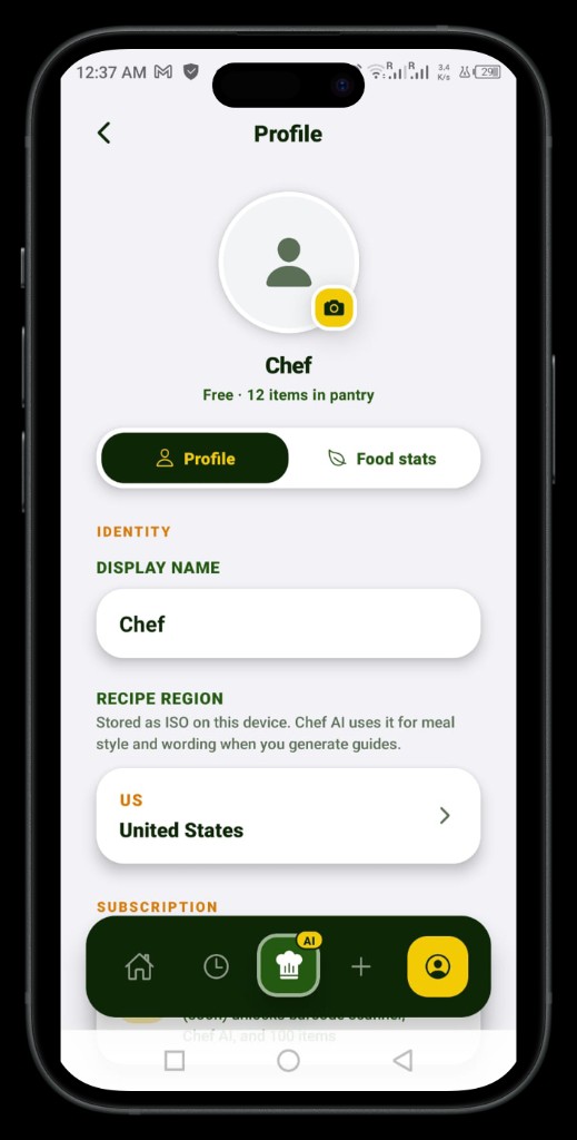
Decision 5: Region-aware AI
The profile screen stores a Recipe Region (ISO country code). The AI uses this to adjust meal style and terminology when generating guides and recipes — so a user in Germany gets different suggestions than a user in the US, based on what's culturally plausible to cook with those ingredients.
04 — OUTCOME
What shipped
4
Core screens shipped
React Native
Cross-platform, one codebase
Internal testing
Real device, real data
Solo
Design, build, and AI integration
The app is in internal testing with a working pantry tracker, item detail and edit flows, overdue expiry states, AI recipe context per item, and region-aware profile settings. Barcode scanning is in the roadmap. The design system is consistent across all screens — dark nav bar, yellow/green accent palette, card-based layouts — built in Figma first, then translated directly into React Native components via Cursor.
This is a product I use myself. That constraint keeps every decision honest.
05 — REFLECTION
What building your own product teaches you
Designing for a client always has a buffer — there's a brief, a stakeholder, a business goal to anchor decisions. Designing for yourself removes that buffer entirely. Every choice is yours and there's no one to blame if a flow feels wrong at 11pm when you're actually trying to use it.
The biggest shift was learning to treat Cursor as a design tool, not just a code tool. When I could prototype a real interaction in minutes rather than hours, I made better decisions about what was worth keeping. The gap between Figma and shipped product got much smaller.
What I'd do differently: define the data model in Figma before touching code. I refactored the item schema twice because edge cases in the UI — partial quantities, unit switching, overdue vs consumed states — weren't obvious until I tried to build them.